Why FDEs should own their interface code, not install a UI library
shadcn/ui copies components straight into your repo, so an admin screen can be reshaped to a client's wishes without waiting on anyone else.
In brief
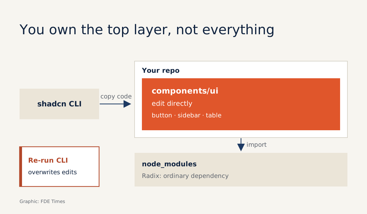
- shadcn/ui is not a library you install: the CLI copies component code into your repo, and you edit it there
- The Sidebar comes ready-made, but the Data Table you assemble yourself on TanStack Table, following a guide
- If the code is yours, so are the patches: there are no automatic updates, and re-running the generator overwrites files
Picture this. On Monday you meet the client; on Friday you have to demo an agent that processes orders. The agent works, but the client’s operators need a screen to review its output, and the project has no designer.
At that point the right tool is one that lets you change every line of the interface inside your own repo. A handsome but closed UI library, one you have to work around to change anything, will slow you down in exactly the week you need to move fastest.
shadcn/ui takes that approach. Its GitHub repo describes it as composable, accessible components. The official documentation goes further: it is not a component library, but a way to build your own component library.
For an FDE this distinction is more than semantics. Every demo reaches the moment when the client wants a small detail changed. Editing a file you own is far quicker than finding a way into a package someone else maintains.
The component code lives in your repo
The project calls this principle Open Code. The documentation is blunt: the top layer of component code is yours to modify directly, and if you want to change a button, you open the button’s code and edit it. When the client wants the status column to show a red badge for overdue orders, you do not override someone else’s styles or wait for a reply to an issue.
Vercel Academy sums it up neatly: traditional libraries create a dependency relationship, while shadcn/ui creates an ownership relationship. Styling is built on Tailwind CSS. Version 4.0 was released on 22 January 2025, and its biggest change moved project configuration from JavaScript to CSS.
The order-review demo, step by step
Back to the order-review screen. Assume you start from a Vite project using React and TypeScript. Tailwind v4 with Vite needs two things: the @tailwindcss/vite plugin and one import line in your CSS file. The shadcn CLI’s add command then adds components and their dependencies to the project.
npm install tailwindcss @tailwindcss/vite
npm install -D @types/node   # so vite.config can use the path module
# in src/index.css, replace the entire contents with: @import "tailwindcss";
Installing the package is not enough: the plugin must be registered in vite.config.ts. While you are there, declare an @ alias pointing at the src directory, because component code imports in the style @/components/ui/button:
// vite.config.ts
import path from "path"
import react from "@vitejs/plugin-react"
import tailwindcss from "@tailwindcss/vite"
import { defineConfig } from "vite"

export default defineConfig({
  plugins: [react(), tailwindcss()],
  resolve: { alias: { "@": path.resolve(__dirname, "./src") } },
})
TypeScript must understand the alias too. In tsconfig.json, and in tsconfig.app.json if your template splits the files, add two lines to compilerOptions: "baseUrl": "." and "paths": { "@/*": ["./src/*"] }. Skip this and init struggles to run cleanly while @/... imports throw errors, an easy place to get stuck when working in a hurry.
npx shadcn@latest init
npx shadcn@latest add sidebar table button
npm install @tanstack/react-table
Because Tailwind v4 is configured in CSS, the place to switch to the client’s brand colours is a CSS file, not a JavaScript one. Being able to change them quickly pays off. When the client’s leadership sees their own brand colours on the screen, it is easier for them to picture the tool as belonging to their company rather than as an outsider’s prototype.
add sidebar, meanwhile, gives you a navigation bar that the documentation describes as composable, themeable and customisable: menu on the left, content on the right, the familiar frame of every admin page.
The most laborious part is the orders table. shadcn/ui’s Data Table is not a pre-packaged table. Instead of shipping a component, the documentation provides a guide for assembling the table yourself on TanStack Table.
Assembling the table this way actually suits work on a client’s site. Say you have 200 orders the agent has processed. The operator only needs to filter by the status awaiting review, sort by creation date to see the oldest orders first, and click a row to see what the agent decided.
You define exactly those columns and attach exactly one sort and one filter, nothing more. The sketch below is minimal but includes all its imports; the table rendering with the Table components you add yourself, following the guide:
// columns.tsx
import { ColumnDef } from "@tanstack/react-table"
import { Button } from "@/components/ui/button"

export type Order = { id: string; status: "needs_review" | "approved"; createdAt: string }

export const columns: ColumnDef<Order>[] = [
  { accessorKey: "id", header: "Order ID" },
  { accessorKey: "status", header: "Status" },
  {
    accessorKey: "createdAt",
    header: ({ column }) => (
      <Button variant="ghost"
        onClick={() => column.toggleSorting(column.getIsSorted() === "asc")}>
        Created
      </Button>
    ),
  },
]
// data-table.tsx (sketch: the table-rendering JSX is omitted)
import { useState } from "react"
import {
useReactTable,
getCoreRowModel,
getSortedRowModel,
getFilteredRowModel,
SortingState,
ColumnFiltersState,
} from "@tanstack/react-table"
import { columns, Order } from "./columns"
export function OrdersTable({ data }: { data: Order[] }) {
const [sorting, setSorting] = useState<SortingState>([])
const [columnFilters, setColumnFilters] = useState<ColumnFiltersState>([])
const table = useReactTable({
data, columns,
getCoreRowModel: getCoreRowModel(),
getSortedRowModel: getSortedRowModel(),
getFilteredRowModel: getFilteredRowModel(),
onSortingChange: setSorting,
onColumnFiltersChange: setColumnFilters,
state: { sorting, columnFilters },
})
// "Needs review" button: table.getColumn("status")?.setFilterValue("needs_review")
// ...render table.getHeaderGroups() and table.getRowModel().rows
}The price of owning the code
The downside sits inside the advantage. Vercel Academy spells out the cost: you lose automatic updates and automatic security patches. According to PkgPulse, to update you re-run the generator command for a component, and that command overwrites the file, so your edits can be lost unless you compare first.
Nor should you assume you own everything. PkgPulse notes that copied components still rely on Radix packages in node_modules. What you hold is the top layer; the layer beneath remains an ordinary dependency.
Accessibility needs watching too. The components were built with accessibility in mind, but once you change the markup to please a client, nobody re-checks it for you. That is acceptable for a demo; if the screen is about to become a live internal tool, agree with the client on who will maintain the interface code before handover.
The ecosystem is still moving. The August 2026 changelog notes that the GitHub registry now works with private repos, meaning a team can collect its customised internal components in one private place. For a client running several projects, that is worth suggesting at handover.
The final limitation is the Data Table. Because you assemble it yourself, it is where you will lose the most time if you are new to TanStack Table. Learn it before the contract is signed, not on Thursday night.
What to learn first, and how to put it on your CV
The sensible order is Tailwind first, since the components are built on it, along with configuring the plugin and alias in Vite. Then learn the init and add commands, and spend most of your time on TanStack Table, the one part you have to understand properly rather than simply copy in and use.
As for your career, a working admin screen is something a hiring manager can click through themselves, which says more than any line describing skills. Do not write a vague “knows React” on your CV. Write something like “built an interface for reviewing agent output, with sorting and filtering on real data”, and link the repo.
You do not need to be a designer. What is worth proving is that when a client asks “can I see it?”, you can open a screen and show them on the spot.
Was this article useful?
Thanks for the feedback!
10 sources
- Introduction - shadcn/ui
- shadcn - shadcn/ui
- GitHub - shadcn-ui/ui: Composable, accessible components with thoughtful defaults.
- Data Table
- Sidebar - shadcn/ui
- Changelog - shadcn/ui · 2026-08
- Tailwind CSS v4.0 - Tailwind CSS · 2025-01-22
- Installing Tailwind CSS with Vite - Tailwind CSS
- Why shadcn/ui is Different (Vercel Academy) · 2025-10-17
- shadcn/ui vs Radix UI: Component Library vs 2026 (PkgPulse Guides) · 2026-03-08